
|
|
| Submitted By: JosJuice Date: December 11, 2011, 03:19:23 am Views: 1104 | |||
First, I would like to thank Tari for his icon creation and extraction tools which helped me a lot when creating this topic, and everyone else involved in Prizm hacking for allowing us all to be able to do what we can do with the Prizm right now. Icons are a part of Prizm add-ins that are usually considered unimportant. They don't affect the add-in itself, but it's still a good idea to create a nice set of icons for your game/program. Users will see it even when they aren't playing your game/running your program, and if someone's add-in menu gets filled with icons that aren't user friendly, the add-in menu may become confusing. To make sure that your icons work well, there are a few things you should think about. Style The object that's the main focus of your icon shouldn't take up all of the 92x64 pixels that it has access to - it should generally be a bit smaller since the background also needs a bit of space (and the things that the Prizm OS will place on it, which we'll get to later). The official icons from Casio are somewhat colorful, somewhat 3D-looking, and they have shadows are slightly translucent. You can follow the style of these if you want to, or create your own kind of icon! 2D sprites work well if they aren't too similar to the backgrounds. If you do something that's different from how things are usually done, please check that it looks good and that things work well. Example icons: 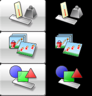 Selected/unselected In all add-ins, two icons must be provided - the selected icon, and the unselected icon. The two icons should show the same object(s) with different backgrounds - not two objects that are completely different from each other or the same object(s) with minor variations. There is one exception, though. When placing text in the icon (this is not recommended!), the text in the unselected icon should be white with a black outline and the text in the selected icon should be black with a white outline. Run-Matrix and Equation are examples of this. The unselected icon should have a pure black background, and the selected icon should have this background: You can use a background that's similar to this one instead, but it's recommended that you use this one for consistency. If you're too lazy to create an actual icon, please use the background with nothing on top of it for the selected icon - don't make the selected icon pure black! The Prizm OS The Prizm OS is a bit quirky when it comes to icons. Our problem when creating icons (apart from the fact that we need two icons instead of one) is that some areas of it will be drawn on in the add-in menu. I have marked those areas in red here:  The square on the top right area of your icon will always be completely unseen, and you should never place anything that might be important there. However, it's recommended that you don't hide any flaws in there, since we don't know if the user is going to use something that isn't the Prizm OS to view the icons. The larger area on the bottom is where the name of your add-in will be placed. The main focus of your icon shouldn't be under it, but since it doesn't cover it completely, you can place things that aren't very important there. For example, a small part of the ruler in Conversion and Geometry is placed there, and an unimportant part of one of the images in the Picture Plot icon is also placed there. You should never place the name of your add-in in the icon since the OS does this for you. |
|||
Rating: This article has not been rated yet. |
|||
|
Powered By SMF Articles by CreateAForum.com